“A Woman with Two Children Transformed a ‘Run-Down’ Apartment in Just 4 Months”: See the Result
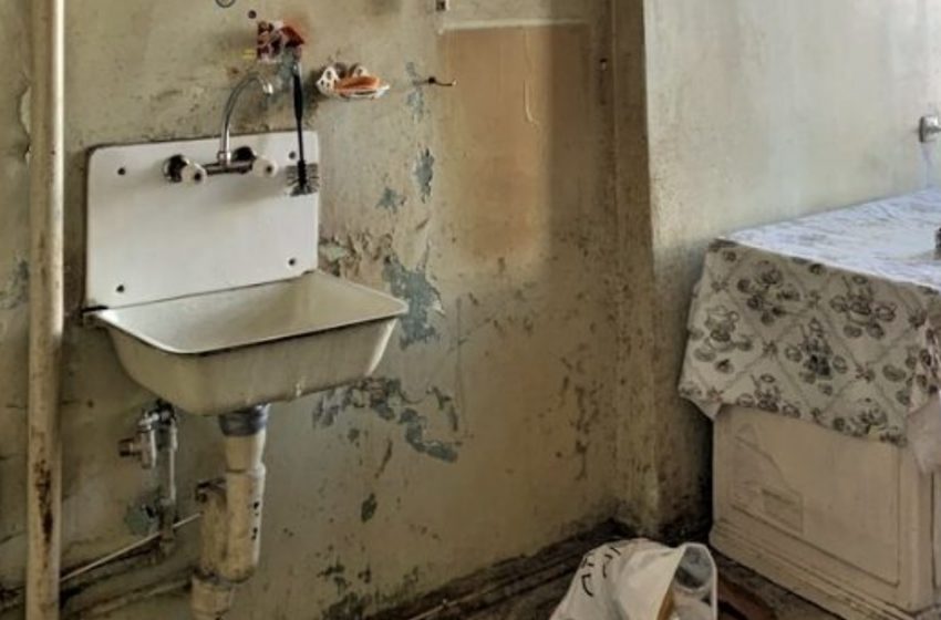
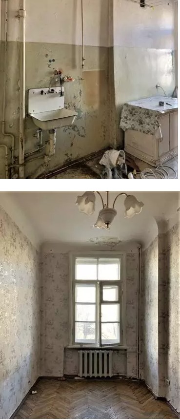
The family moved here from a larger home, so the primary goal was to create a modern, functional space that would suit everyone. To tackle the less-than-ideal initial state of the apartment, the owner opted for a designer’s expertise.
They kept the layout intact, preserving each area’s original dimensions. The entryway is narrow and long, with ceramic tiles on the floor and a two-tone color scheme with molding details on the walls. Immediately to the left of the door is a large storage system integrated with a bench.
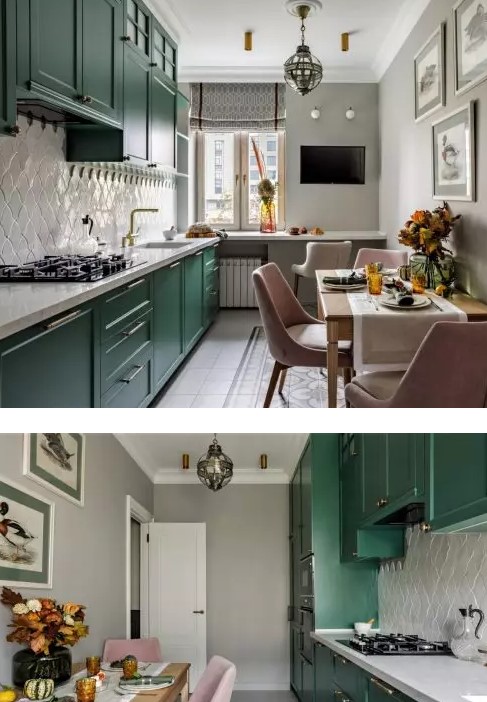
The kitchen floor is covered in light ceramic tiles, while the walls were given a soft gray shade. The linear kitchen setup occupies one wall with bright green cabinets, and a backsplash made of creative white tiles adds flair.
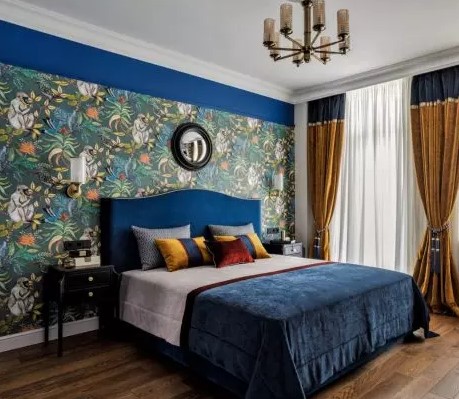
Opposite, there’s a full dining area, and the windowsill was extended to serve as a breakfast bar or extra workspace.The largest room was transformed into the master bedroom. The floor is covered with engineered wood, walls are painted in light tones, and a feature wall is dressed in bold wallpaper for an accent.
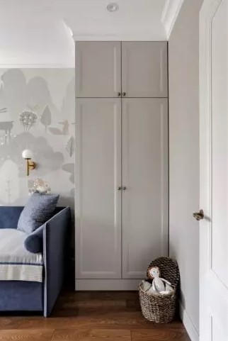
The son’s room has light-colored walls, with a spacious closet to the right and a bed to the left. An extended windowsill serves as a comfortable study area.
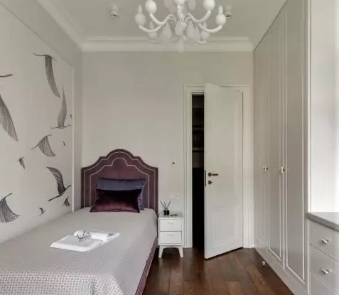
The daughter’s room follows a soft, light color scheme. A built-in storage unit with white fronts lines the left wall, while the bed sits opposite. The wall near the bed is decorated with a mural of cranes, adding a touch of serenity.
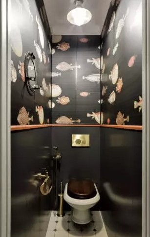
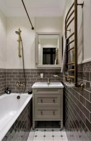
In the toilet, the floor mirrors the bathroom’s design. The walls are painted black and decorated with illustrations of small fish, creating a unique ambiance.


